Aptos, designed by Steve Matteson for Microsoft, is a modern sans-serif chosen as the new default Office font in 2023, replacing Calibri. It combines geometric precision with a warm, humanist touch, making it highly legible on screens while retaining a professional look. Its straightforward clarity makes it ideal for business documents, branding, and digital products.
However, not every project can use Aptos due to availability or licensing restrictions, so designers often look for alternatives with a similar tone.
Here’s our curated list of 7 typefaces similar to Aptos, including both premium and free options.
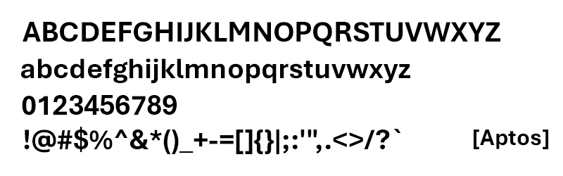
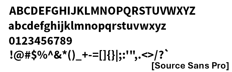
Visual Comparison
Sample Text: The Quick Brown Fox Jumps Over The Lazy Dog
| Font | Preview |
|---|---|
| Aptos | Image preview below |
| Helvetica Now | Image preview here |
| Neue Haas Grotesk | Image preview here |
| FF Bau | Image preview here |
| Aktiv Grotesk | Image preview here |
| Inter | Image preview here |
| Source Sans Pro | Image preview here |
| IBM Plex Sans | Image preview here |
Premium Alternatives
1. Helvetica Now (Monotype, 2019)
Style: Sans-serif, Neo-Grotesque
Why It’s Similar: Shares Aptos’ clean neutrality and professional tone.
Key Difference: Rooted in Helvetica’s classic heritage with more refined spacing.
Price & Availability: Paid — Monotype.
2. Neue Haas Grotesk (Christian Schwartz, 2010 revival)
Style: Sans-serif, Grotesque
Why It’s Similar: Crisp, highly legible forms comparable to Aptos.
Key Difference: More historical authenticity than Aptos’ modern polish.
Price & Availability: Paid — Commercial Type.
3. FF Bau (Christian Schwartz, 2002)
Style: Sans-serif, Grotesque
Why It’s Similar: Balanced, workhorse quality for text and display.
Key Difference: Slightly more industrial character.
Price & Availability: Paid — FontFont.
4. Aktiv Grotesk (Dalton Maag, 2010)
Style: Sans-serif, Neo-Grotesque
Why It’s Similar: Designed as a modern Helvetica alternative, matching Aptos’ functional tone.
Key Difference: Sharper terminals and a stronger digital focus.
Price & Availability: Paid — Dalton Maag.
Free Alternatives
5. Inter (Rasmus Andersson, 2017)
Style: Sans-serif, Neo-Grotesque
Why It’s Similar: Modern screen-first sans with excellent legibility.
Key Difference: More versatile across UI and body text.
Price & Availability: Free — Google Fonts.
6. Source Sans Pro (Paul D. Hunt, 2012)
Style: Sans-serif, Humanist
Why It’s Similar: Professional tone, widely used in digital contexts.
Key Difference: Slightly more humanist warmth compared to Aptos’ geometric clarity.
Price & Availability: Free — Google Fonts, Adobe Fonts.
7. IBM Plex Sans (Mike Abbink & Bold Monday, 2017)
Style: Sans-serif, Grotesque
Why It’s Similar: Corporate neutrality with similar functional feel.
Key Difference: Stronger brand-driven character with unique quirks.
Price & Availability: Free — Google Fonts.
Recommendation Summary Table
| Font Name | Similarity Score | Free/Paid | Best For |
|---|---|---|---|
| Helvetica Now | ★★★★★ | Paid | Branding and corporate design |
| Neue Haas Grotesk | ★★★★☆ | Paid | Editorial and print |
| FF Bau | ★★★★☆ | Paid | Text-heavy projects |
| Aktiv Grotesk | ★★★★★ | Paid | Modern digital branding |
| Inter | ★★★★☆ | Free | UI/UX and apps |
| Source Sans Pro | ★★★★☆ | Free | General-purpose text |
| IBM Plex Sans | ★★★★☆ | Free | Corporate and product design |
Conclusion
If you want the closest premium alternatives to Aptos, Helvetica Now and Aktiv Grotesk are excellent choices.
For free substitutes, Inter and IBM Plex Sans provide highly versatile replacements for digital and print use.

